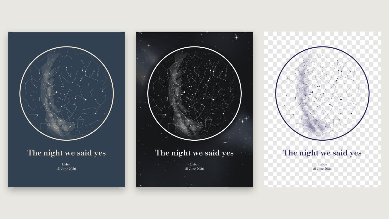
Every message you send us gets read — from the contact form, from replies to our emails, and from the short notes people leave when they cancel. Not long ago one of those notes said, in a single line, that the map had too many stars. It was a fair point, and it’s the reason for the first feature below.
Here is everything new in the map editor, in One map and in Studio alike.
1. Choose how many stars your map shows
Until now every map showed every star you could see with the naked eye on that night — thousands of them. True to the sky, but on a poster it can turn into a fine dust of dots that buries the constellations you actually want to see.
The new Stars slider, from Fewer to More, lets you decide. Slide it down and the faintest stars drop away first, leaving the bright ones that make up the familiar shapes. The map gets calmer and easier to read, and it’s still the real sky from your place and moment — just less of it.
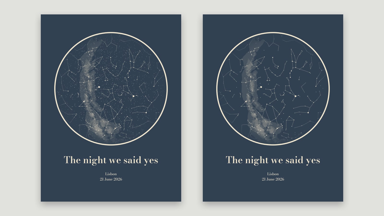
While we were at it, bright stars now come out noticeably larger than faint ones, across every map. Before, they looked much alike; now the brightest stand out the way they do in a real night sky, which gives the map more depth. And if you want a closer look before you buy, click the preview to see it enlarged.
2. Space backdrop
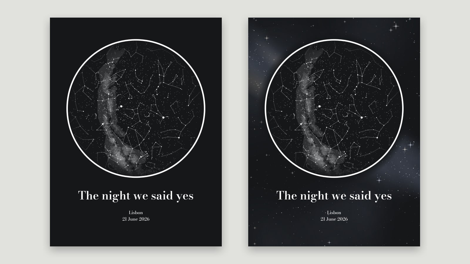
Turn on Space backdrop and the plain colour around the map becomes deep space: scattered stars and a soft band of nebula, framing the circle. It’s purely decorative — the map itself always shows the real sky — and it’s designed for dark colour schemes, where it gives the whole poster an atmospheric, gallery-print feel.
3. Transparent background
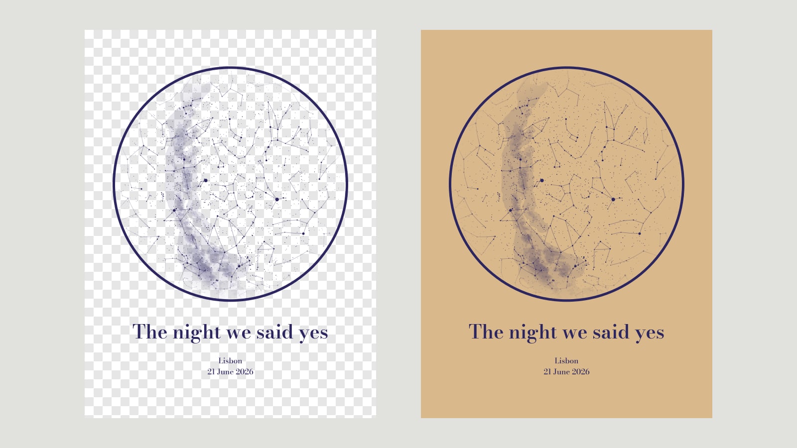
Transparent background removes the background entirely — around the map and inside the circle. What’s left is only the stars, constellation lines, the ring and your text, in your chosen colour, as a PNG with transparency.
That makes the map easy to put on anything: a t-shirt, a mug, a tote bag, a wedding invitation, or your own design in Canva or Photoshop. Pick a colour that reads well on whatever the map will sit on — dark lines for light materials, light lines for dark ones.
For API users
All three work through the API too: star_limit (a magnitude from 3.5 to 6; lower means fewer stars), poster_backdrop=true and poster_transparent=true. All three are optional; left out, you get every star, no backdrop and a solid background. Details are in the API reference.
Tell us what’s missing
To make this easier, there’s now a Feedback tab on the edge of the editor, and a “Missing a feature?” link right under the buttons. Write a sentence — what’s missing, what’s confusing, what you’d love to see — and it lands straight in our inbox. Leave your email if you’d like a reply.
Pick a place and a moment, play with the star slider, and preview it free.
Open the map editor